

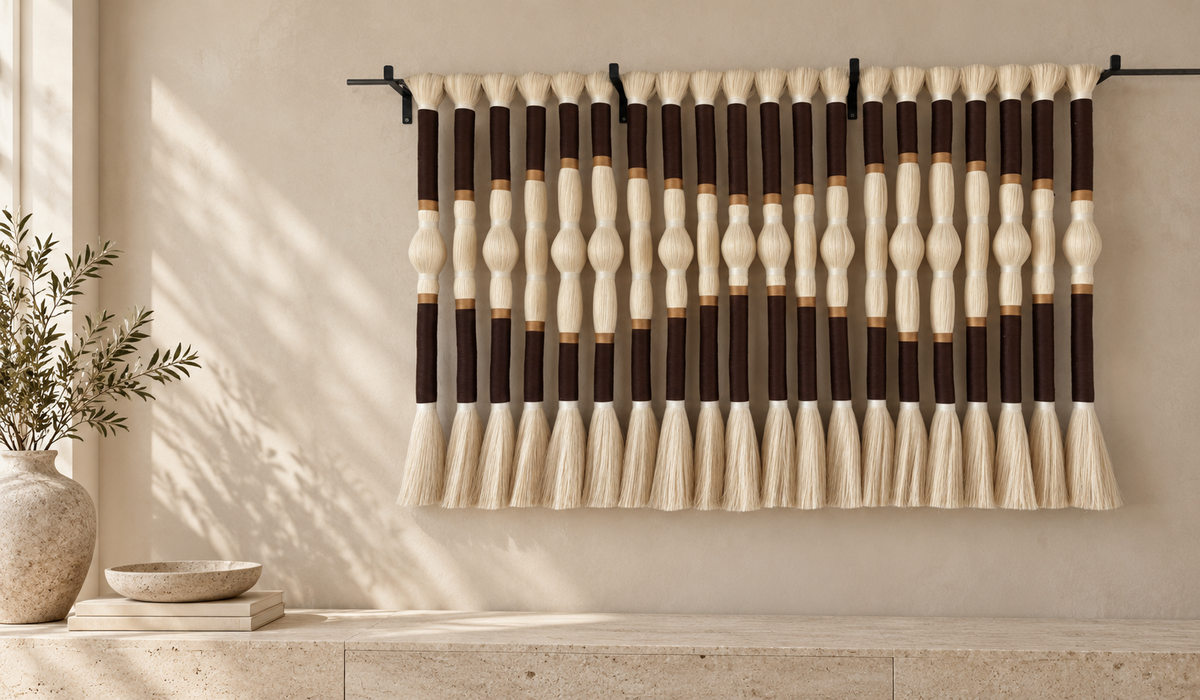
A large blank wall can make a finished room feel strangely unfinished. The solution is not necessarily to fill every inch. First decide what the wall should do: anchor the seating area, connect two zones, introduce color, or add a tactile counterpoint to smooth furniture. Then select the amount of visual weight it needs. A narrow entry wall and an expansive wall above a sectional might have the same square footage but call for very different compositions.
Before choosing an object, photograph the wall straight on with furniture in place. Measure its width, height, and the furniture below it. Mark doors, vents, switches, sconces, and traffic paths. Put paper outlines on the wall or tape the possible artwork footprint. Stand at the room's usual viewing points, not just directly in front of the wall. The following ideas work because each gives the blank space a clear role.
15 ways to make the wall work
1. Hang one oversized artwork. A single large piece gives a room a focal point without creating many competing edges. This is especially useful above a long sofa or in a tall lobby. Compare the artwork's actual width with the furniture beneath it before ordering.
2. Choose fiber art for softness. Textile work offers shape, movement, and texture. It can visually soften glass, metal, polished stone, or sharply outlined furniture. See Macrame & Fiber Wall Art for examples with different proportions.
3. Build a group of woven wall plates. Start with the largest piece slightly off center, then place smaller plates around it. Keep the space between pieces reasonably consistent so the grouping reads as one composition. Browse Wicker Wall Plates.
4. Hang a sculptural set. Three dimensional wall pieces cast changing shadows and give a wall depth without a picture frame. This works particularly well where side light can reveal the relief. Wall Tubes offer one route.
5. Use a long horizontal work. A wide, shallow shape can bridge a sofa and the open wall above it. It often feels calmer than several small works spaced in a straight line.
6. Try a tall vertical piece. Between windows, alongside a stair, or near an entry, a vertical work can emphasize height while leaving room for a bench or console below.
7. Pair two related pieces. A diptych brings rhythm without the visual busyness of a gallery wall. Test both equal spacing and slightly offset heights with paper templates.
8. Assemble an asymmetrical gallery. Combine a few larger anchors with smaller works, but unify them through a palette, material, or frame finish. The empty space between objects is part of the design.
9. Add a picture ledge. A ledge makes it easy to change photographs and small artworks. Check the ledge and wall anchors for the combined load; secure objects where children or pets may reach them.
10. Let color become the backdrop. A restrained paint color or limewash effect can bring definition to a wall even before art goes up. Test a sample in morning and evening light.
11. Introduce architectural lighting. Wall washers or well placed sconces can make an existing artwork more present. Avoid harsh, close light on delicate fibers; ask a lighting professional if heat or UV exposure is a concern.
12. Combine art and a console. A low cabinet gives the wall a functional base. Keep lamps and objects below from obscuring the main artwork.
13. Use mirrors selectively. A mirror can reflect a desirable view or bring light into a darker zone. Check its reflection from the seating position before drilling.
14. Consider shallow shelving. Shelves suit a wall that must display books or objects, but too many small items may make the room feel crowded. Leave open sections for visual rest.
15. Commission for the wall. When standard dimensions or colors never quite fit, a custom piece can respond to the architecture. Sarmal Design discusses sizes and palettes for selected designs through its For Interior Designers page.
Match the approach to the room
In a living room, furniture usually provides the clearest reference line. Group the artwork visually with the sofa or sideboard beneath it, rather than centering it automatically on the entire wall. In a dining room, look at the artwork from seated eye level and account for pendants or wall lights. In a hallway, a series of smaller works may support movement more comfortably than a very deep sculpture. For a tall stair wall, mock up the placement from both the lower and upper landings.
Scale also changes with viewing distance. A textured detail can be rewarding up close yet disappear across a large open plan room. Conversely, a strong dark composition can dominate a narrow space. Take photos of your paper mockup from the doorway, sofa, and adjacent rooms. If the piece looks undersized in every image, increase its width or group it deliberately with other elements.
A simple decision process
Ask three questions: Is the wall missing scale, texture, or function? Scale suggests one substantial work; texture suggests woven or sculptural materials; function may call for shelving, a console, or lighting in addition to art. Limit the palette to colors already present in the room, then add one intentional contrast if the space needs energy. For a neutral interior, even cream artwork can be expressive when its shadows, fringe, or structure vary.
Plan the installation as carefully as the composition. Confirm the substrate, artwork weight, fixings, clearance above furniture, and access for cleaning. Adhesive strips should only be used when the artwork and surface are explicitly suitable. For heavier pieces or uncertain walls, ask a qualified installer. If you want the work to fit a particular wall, send measurements, a straight on photograph, and your preferred palette when requesting a custom project discussion.
Next step: Explore handmade fiber wall art, woven wall plates, and sculptural Wall Tubes to decide which kind of presence the wall needs.
Common mistakes on a large wall
The first mistake is buying several small items before planning the overall shape. Individually beautiful pieces can look disconnected when their collective footprint is too narrow or when the spacing changes without intention. Sketch a bounding box around the entire proposed group. Treat that box as you would one artwork, then arrange the objects inside it. A second mistake is copying a product image that was photographed in a room with different ceiling height or furniture. The same artwork may need a different position and a different amount of surrounding space in your home.
The third mistake is forgetting the room after dark. A pale textile can glow in afternoon sun and seem subdued under a single ceiling lamp. A metal sculpture may look flat without angled light. Take your mockup photograph in both daylight and your normal evening lighting. The fourth mistake is using every wall. If the principal artwork has enough presence, leaving an adjacent wall open can make the whole interior feel more composed.
Finally, do not confuse physical size with visual weight. An open woven piece, a dark solid canvas, and a collection of circular plates can all span 150 cm yet feel completely different. Look at the density and tonal contrast as well as the measuring tape. This is why shortlisting silhouettes before choosing colors is so useful.
If you are choosing for a project
Residential and hospitality briefs benefit from different questions. For a home, ask where people sit and how close they will come to the work. For a hotel, restaurant, or reception, include traffic, access for cleaning, and the view from the entrance. A long wall may support a coordinated series, but the number of pieces should follow the architecture rather than an arbitrary target. Consider how signage, plants, lighting, and furniture will share the same field of view.
Send the maker a front facing photograph with a tape measure visible if you need help evaluating scale. Include ceiling height and the size of the furniture beneath the work. If the desired art must be seen from across a large room, say so: the brief should guide both the artwork's proportions and the strength of its overall silhouette.
Frequently asked questions
Should art fill the whole wall? Usually no. Open wall around the composition helps it read clearly. The amount of space depends on adjacent doors, furniture, and the room's scale.
Can one artwork mix with shelves or sconces? Yes, if the objects have a hierarchy and their clearance and mounting are planned together. Mock up everything at once.
Is a gallery wall better than one large piece? A gallery wall is flexible and personal; one large work is often calmer. Choose the experience you want from the room and make the total composition proportionate.


